Being bored and having much to do, I did none of it and did
this instead. This is my ode to the human memory. My recollection of emblems I
see every single day of my life, yet retain so little of the detail. To the point
where if I do try to let's say... draw them from memory, I quite simply cannot.
I live for the NFL. Show me a logo and
I will instantly recognize it. Easy, right. But try to draw one of them without
looking at it and you will know what confusion is. I knew what confusion was as
soon as I tried to draw some of them, but instead ended up with some sort of Salvador
Dali reject animal. Without further ado, here is something.
Note: I put the Logo beside my depiction afterwards, for easy comparison.
Note: I put the Logo beside my depiction afterwards, for easy comparison.
NFC NORTH
Minnesota Vikings:


This was fairly easy. I have drawn it before, I see it at least 100 times a day. I'm surrounded by it, it's from my favourite team. The drawing is not perfect, but don't harp on me because I don't know the intricacies of the French braid. He looks kind of tired too, like the kind of tired you get from a few years of losing.
Green Bay Packers:


It's just a G. My most hated G mind you, as I was going to
just draw a big poop but better judgement prevailed. Oh well.
Chicago Bears:


It's just a C. They have a bear logo, but it's an alternate one. The most common logo will be drawn even if the
results are this boring. Kind of like watching the bears.
Detroit Lions:


This was the first point in this project where I realized I
know what they look like, but not really. Poor lions. Or should I say jumping
monkeys as this is a more accurate description of what I created. This logo also
introduced the problems such as; which way does the logo face, how detailed are
the logos, and "should I give up." Hold on to your hats, it only gets
worse.
NFC EAST
Dallas Cowboys:


Okay, I cheated on this one. I used the star tool on paint.
I don't care.
New York Giants:


Yawn. I think I got this right, it's 2 letters. A little
difference in the font but again, who cares. Moving on.
Philadelphia Eagles:


This is a really cool logo, which I got really wrong. The real logo is sloped a bit and you know, looks like an eagle. This one made me realize that
details might as well not exist in my mind, as you are getting 6 lines that
form a bird. Doesn't even matter which bird it is.
Washington Redskins:


A picture says a thousand words. This one doesn't say any
good words. My depiction also has more than twice as many feathers as the
actual logo, 10x as much mouth, and 1000x less forehead. This is the first one that I feel like apologizing for. I am sorry.
NFC SOUTH
New Orleans Saints:


I don't remember what a fleur du lis looks like, but it's a French thing that doesn't look like this. It also doesn't have veins like a leaf, I drew an underdeveloped maple leaf.
Atlanta Falcons:


I went to a high school where the falcon was our logo. This should mean I can draw a good falcon logo, right? Nope! Mine looks like someone stabbed a seal with a Ruffles potato chip.
Tampa Bay Buccaneers:


This is the one logo that I just couldn't for the life of me remember. That's why it looks like the raiders logo's cowboy brother who got lost at sea. The real logo is a flag with a skull on it. This one has zero of either of them. I feel like I should send a handwritten apology to all Buccaneer fans. Which shouldn't take long, as there are only about 3 of them.
Carolina Panthers:


I... don't know. Cat pig? Not even close. Screw animal logos for the remainder of this article.
NFC WEST
San Francisco 49ers:


I like the 49ers. You wouldn't know that from this. I drew the alternate logo, kind of. This more difficult of a task than I once thought.
Seattle Seahawks:


I do not like the Seahawks. The real logo has a larger eye and none of the lines I put in the back. I wished I fucked up this logo even more badly, I do not like the Seahawks.
St. Louis Rams:


Okay, I sort of like this one. The horn looks mighty fine. I give myself a passable grade, Which in this case is still like a 51. You're not proud of it, it's not going on the fridge, but it's still technically a pass.
Arizona Cardinals:


What happened to any angry birds characters that got rejected from being put in the game? Well, they got transferred into my mind as what I think the cardinals logo is.
AFC NORTH:
Pittsburgh Steelers:
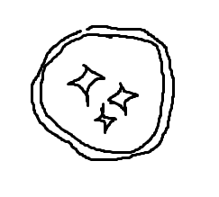

Person: Hey, who threw 3 throwing stars in the toilet?
Creator of the Steelers logo: It was me.
Dialogue aside, I forgot to put the word "Steelers" beside the stars, which are all supposed to be the same size. I messed up here to no one's surprise.
Baltimore Ravens:


The Ravens have my permission if they would like to switch to this logo. Just, let me know Baltimore.
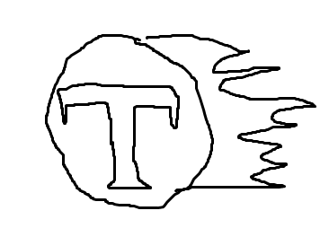
Cincinnati Bengals:


The letter B with pinstripes. Rad. They have two other logos that are actually Bengal tigers, yet they settle for this. This logo is the visual equivalent of losing every year in the wild card round. How fitting.
Cleveland Browns:

AFC EAST:
New England Patriots:


Johnny Bravo in a wind tunnel meets Captain America.
Buffalo Bills:


Who's that Pokemon? A swollen head dog? No, it's maybe the Bill's logo. Again, I remembered the alternate logo for whatever reason. The reason being I'm stupid.
New York Jets:


J E T S... forgets forgets forgets... the NY and the ball. Mine looks like the logo of a gas station you avoid because the truckers that hang around it harass you while you're in the bathroom.
Miami Dolphins:


So close. I forgot the sun and that it's not a skinny manatee.
AFC West:
Denver Broncos:


Now welcoming to the field; The Denver Confused Chinese Anteaters.
San Diego Chargers:


It's actually good, regardless of what you say.
Kansas City Chiefs:


"I did it. I gave Dory from Finding Nemo the tattoo of 'KC'"... It's supposed to be an arrowhead.
Oakland Raiders:


I almost put in the Buccaneers' logo again. I think I did this one okay though. He's smiling even though he got stabbed twice through skull. There's supposed to be a shield around it, and he's supposed to be wearing a helmet too. But most Raiders fans wear bandannas anyway in my mind so you can understand where I'm coming from here.
AFC SOUTH:
Indianapolis Colts:


Finally, an easy one. Anyone can draw a toilet bowl with aeration holes for when you get sweaty taking a poo. I mean, a horseshoe. Side note: I just realized that horseshoes are a symbol of luck and that their quarterback is also Luck. Whoa... moving on.
Houston Texans:


Simple. Elegant. Nothing like what it's supposed to be. The real logo is shifted to the right and has a star for an eye. I still like mine.
Tennessee Titans:

It's like I started putting effort into drawing the real thing but then stopped because the Titans are not worth my time. Wait, that's almost exactly it.
Jacksonville Jaguars:


Hahahahahaha... Christ... just kill it. This is the panthers logo I drew that got hit by a car.
[FIN]
Vikings Game
ReplyDelete49ers Game
Seahawks Game
Colts Game
Browns Game
Bengals Game
Patriots Game Today
NFL Games Today
ReplyDeleteBuccaneers NFL Game Live
Saints Game Live Online
Watch Saints Game Live
New Orleans Saints Game Live
Saints Game Live Stream